Dimensions:
The dimensions with and height of the data-grid. The width can be calculated by the extension if you check the Autowidth checkbox. If the height is void the extension show all the record without vertical scrollbars
Grid resizable:
Is checked the grid will be resizable and can be defined the min and max dimensions
Skin:
Select the skin you want use for the datagrid. The extension has 24 predefined skin but there is an on-line site where you can create your own skin. See in the flash tutorial how work this feature.
Page size:
Define the number of records the grid will display for each page, if is set to zero the grid show all the records
Paging options:
Define the paging options, the number of records the user can display
Caption:
Defines the Caption layer for the grid. This caption appear above the Header layer. If the string is empty the caption does not appear.
Language:
The language for the default texts, available languages are: Bulgarian, Catalan, Czech, German, English, Persian, Finnish, French, Greek, Italian, Japanese, Polish, Portuguese (Portugal), Portuguese (Brazil), Russian, Swedish, Turkish
Encoding:
The encoding is a very important setup and the asp page, the database fields and the extension must have the same encoding to show correctly the special char.
Paging:
If checked the grid enable the paging but only if is setup the page size. In this case the grid show the number of records is setup in the Page Size.
Pg buttons:
If checked the gris show the pager buttons, if pager is present
Pg field:
If checked the grid show the input box for current page, if pager is present
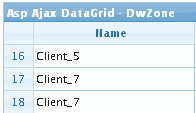
Row numbers:
If checked show the rows number in the first left column of the data grid.
Like this example:

Alt rows:
If checked show the cell content on mouse over event, some browser show this options by default.
Resizable:
If checked the columns can be resized by the user, will be resizable only columns marked as resizable in the column settings
Show toggle btn:
If checked the grid enables the show/hide grid button, which appears on the right side of the Caption layer. Takes effect only if the caption property is not an empty string. This option is not supported in RTL mode
Autowidth:
If checked the extension calculate the data grid with on sum the single columns width
View sort cols:
If checked the columns that can be sorted will show a little icon in the left of the header text.
Multiselect:
If this flag is set to true a multi selection of rows is enabled. A new column at left side is added.
Shrink to fit:
If checked the columns fit the width, if not the horizontal scroll bar is show (if needed)
Search:
If checked the search is enabled and in the navbar appear the search icon. The user can filter the grid rows to search the records that match it's filter. The search can be done on the columns that are marked as search in the columns setup
Multiple search:
If checked the search can be have multiple group for extended search
Show search query:
If checked the where clause is show in the top of the search form
Footer rows:
If checked appear a new row in the bottom of the grid where you can show columns totals and text. This setup is made in the columns setup where for each column you can setup the footer row content that can be a text or the column sum (only for numeric columns).
Search like char:
This parameter depend on your database and is the char used for LIKE search. For example MsAccess need % and SqlServer need *
Search date char:
This parameter depend on your database and is the char used for enclose data value in the search string. For example MsAccess need # and SqlServer need '
Thousand separator:
If checked the number will be formatted with thousand separator.
Image checkbox:
If checked the boolean fields will be formatted with images like

and

Very important: if you call the page with parameters in the query.string don't use "id" and "nd" name for the parameters because are reserved and are used by the extension.

